
In accordance with the trademark design registration standards, the following words and graphics shall not be used for trademarks (excerpted from Article 8 1-9 of the Trademark Law)
1. Identical with or similar to the state name, national flag, national emblem, military flag or medal of the people's Republic of China;
2. Identical with or similar to the state name, national flag, national emblem, military flag or medal of a foreign country;
3. Identical or similar to the flag, emblem or name of an intergovernmental international organization;
4. Identical or similar to the symbols and names of the "Red Cross" and "Red Crescent";
5. The general name and graphics of the commodity;
6. Directly indicating the quality, main raw materials, functions, uses, weight, quantity and other characteristics of the commodity;
7. Ethnic discrimination;
8. Exaggerated propaganda and deceptive;
9. Harmful to socialist morality and customs or have other adverse effects.
Recently, I saw a trademark rejected on the grounds that it was similar to other trademarks,
It feels like the end of the designer,
This is rejected,
This is similar,
How to design is not approximate,
What is the approximate standard?
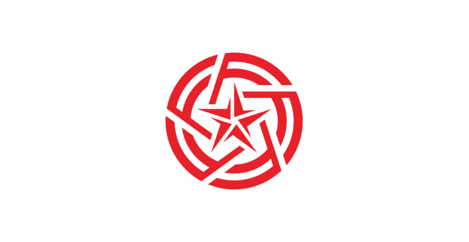
The newly applied trademark design pattern is as follows:
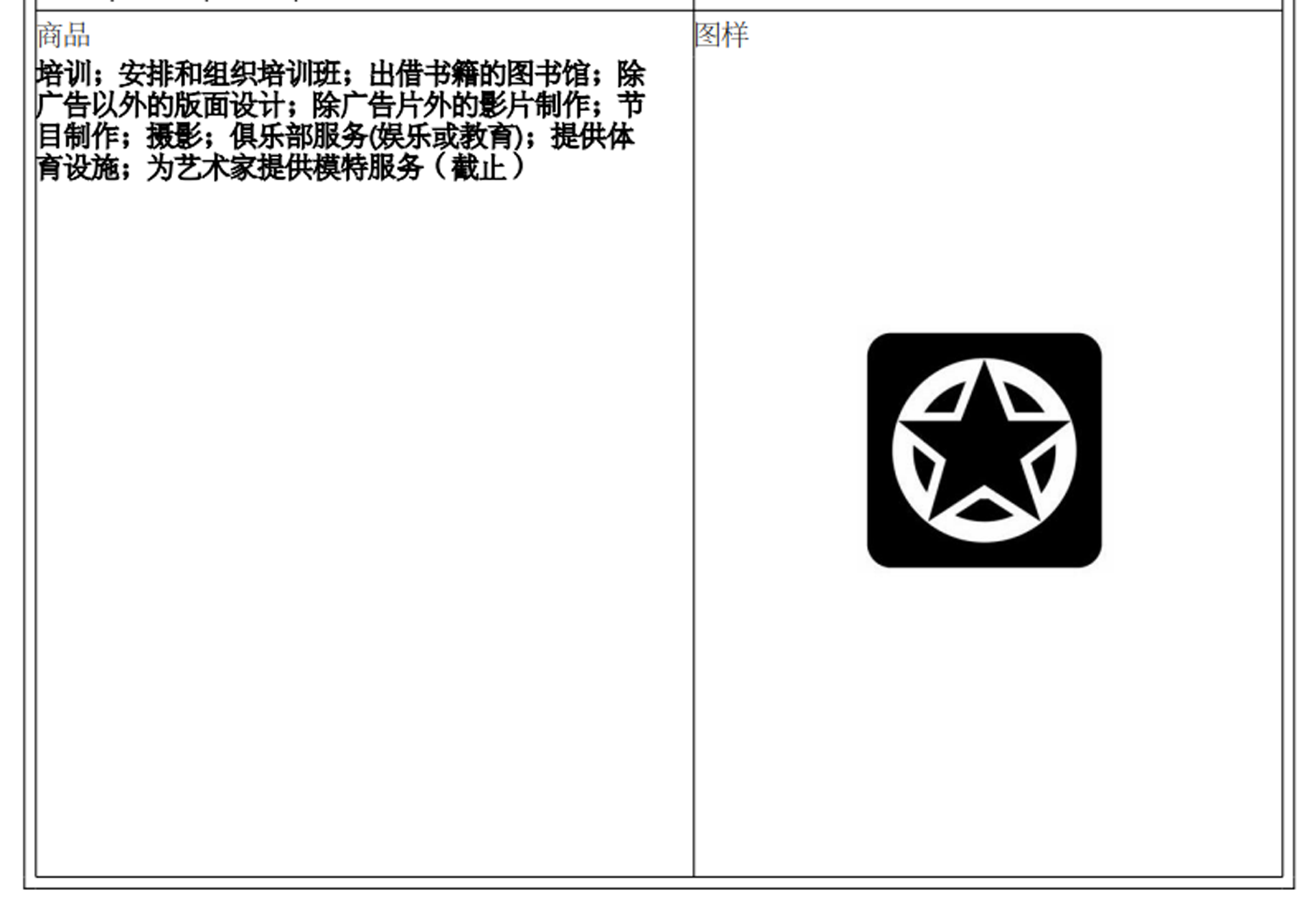
Similar to class 41 trademarks
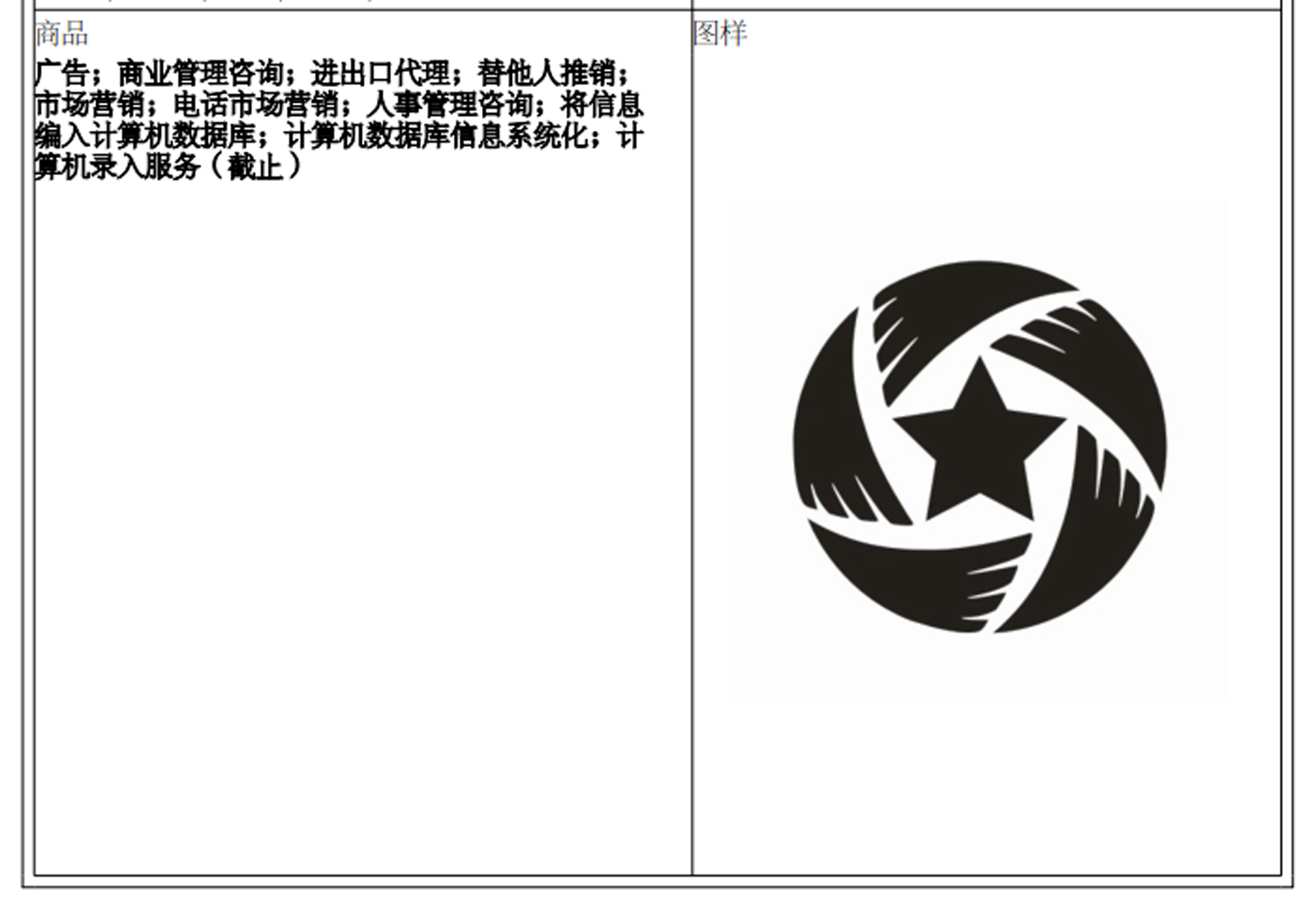
Similar to class 35 trademarks

The above trademarks,
Is it really similar?
I think
Who looks
Everyone is "short-sighted"

· Industrial design
· Mechanical design
· Brand design
· Product development
· Original brand
 Design Director
+86 135 3070 0282
Company:Shenzhen Chunidea Technology Co., Ltd.
Address:8th Floor, Haopinju, Guanlan High tech Park, Longhua District, Shenzhen ,China.
Telephone:+86 135 3070 0282
Website:www.chunidea.com
Email:chun@chunidea.com